DPI versus PPI versus DPPX


This post will compare and clear the confusion among Dots Per Inch (DPI) versus Pixels Per Inch (PPI) versus Dots Per Pixel Unit (DPPX).
My post will cover the usage of these terms in web (CSS, Javascript), Android, iOS, printing fields.
Dots Per Inch
- Dots Per Inch (DPI): only used in physical printing. It specifies the number of color dots is printed in a physical one-inch (or 2.54cm) length in the printed material (papers, walls, etc.). This value mostly presents the capability of a printer. Equivalently, there are also dots per centimetre (d/cm or dpcm) but they are less frequently used.
Printers' standard DPI is 300dpi. 150dpi is considered a low value. Some printers support up to 600dpi, 1200dpi, 1440dpi.
Pixels Per Inch
- Pixels Per Inch (PPI): used for digital screens (monitors, projectors, etc.) and digital media files (videos, images, etc.). For digital screens, it indicates the number of (physical) pixels that can be displayed in a physical one-inch (or 2.54cm) length on the screen. For digital files, it indicates the quality in which the file is intended to be displayed on digital devices or to be produced physically.
Note 1: not all digital file format includes PPI information.
Note 2: the definition of physical pixel (in contrast to logical pixel) will be declared in the next section.
Note 3: More about this will be explained in the next section.
We have Physical Resolution / PPI = screen's physical dimension in inch. If we know the screen's physical resolution and its PPI, we can calculate its physical size. Similarly, the image's dimension in (logical) pixel and PPI information can be used to infer the physical size of the image at which the media is intended to be displayed.
The standard screen's PPI is 72PPI (defined by Apple/Macintosh) or 96 PPI (defined by Microsoft Windows) (check this blog from Microsoft to know the origin of the 96 and 72 numbers).
The human eye retina's PPI in an average condition is under 300PPI. This explains why Apple calls a class of its displays Retina. The Retina is technically equivalent to HiDPI, as Retina is the marketing brand trademarked by Apple.
So, if a normal human eye can discriminate two points separated by 1 arcminute/cycle at a distance of a foot, we should be able to discriminate two points 89 micrometers apart which would work out to about 287 pixels per inch
Equivalently, there are less frequently used terms: pixels per centimetre (ppcm or pixels/cm).
DPI vs PPI
While PPI has the same unit and a similar meaning with DPI, PPI is used for digital files and digital displays, and dpi is used for printers. Sometimes, PPI and DPI are used interchangeably.
The reference pixel is the visual angle of one pixel on a device with a pixel density of 96dpi and a distance from the reader of an arm’s length. For a nominal arm’s length of 28 inches, the visual angle is therefore about 0.0213 degrees. For reading at arm’s length, 1px thus corresponds to about 0.26 mm (1/96 inch).
I’ll use the term PPI in this blog entry as it more accurately reflects usage for computer screens while DPI is more common for print usage. Windows tends to use the DPI acronym
In order to achieve a similar quality in the digital display, the printer should have much higher DPI support. For example, a 600DPI printer is capable of producing an image of similar quality as it is displayed in 300PPI on a monitor. This is because the supported range of colors for each dot available on a printer is much limited compared to monitors.
Device pixel ratio (DPR), dot per pixel (dppx)
Dots Per PX unit (DPPX): used in web CSS styling and mobile/desktop app developments. This is an application-specific term, usually comes with related keywords, such as 1x, 2x, 3x, or @1x, @2x, @3x. You typically see it while developing a website or a mobile/desktop application. Why do we need this?
To demystify this question, we need to declare several terms.
Physical pixel and logical pixel
- Physical pixel: a physical object, the screen's physical pixel, never change from when the screen is manufactured.
- Logical pixel (= reference pixel in CSS =
ptin iOS =dpin Android): logically defined by the OS. In most cases, OS and applications refer to values in this unit.
One logical pixel on the screen can be less than, equal to, or more than, one physical pixel. The conversion rate from one logical pixel to one physical pixel is defined by the OS.
Screen resolution
Screen resolution is the number of pixels included in a vertical/horizontal line of the screen. Similar to physical/logical pixel, there are:
- Physical screen resolution: the number of physical pixels included in a vertical/horizontal line of the screen. This value is rarely used.
- Logical screen resolution: the number of logical pixels included in a vertical/horizontal line of the screen. OS and applications usually refer to this value.
Example 1: 13.3-inch Mac Pro
13.3-inch (diagonal) LED-backlit display with IPS technology; 2560-by-1600 native resolution at 227 pixels per inch with support for millions of colors
Supported scaled resolutions:
1680 by 1050
1440 by 900
1024 by 640
2560-by-1600 is the physical resolution, while 1680-by-1050 is a logical resolution.
Example 2: iPhone X has a resolution of 1125x2436 pixels (from Wikipedia), but when we check for its resolution, it is only 375px wide. 1120px is physical resolution, 375px is logical resolution.
Logical resolution can be arbitrarily changed by the OS. It can be larger or smaller than the physical resolution. Similar to physical pixels, physical resolution cannot be changed.
Device Pixel Ratio
The number of physical pixels per logical pixel is called Device Pixel Ratio (DPR).
- Theoretical DPR: the number of physical pixels used to display one logical pixel.
Note: there is not physical DPR.
Note: theoretical DPR can be changed by changing the screen's logical resolution. - Logical DPR: a logical value defined by the OS in each display mode, represents the logical value of the theoretical DPR to be referred to by applications. This value should be close to the theoretical DPR, but not need to be.
Before Apple introduced iPhone 4 in 2010, smartphone displays had their physical pixel equals to the logical pixel. With the introduction of the Retina display, iPhone 4 has a screen physical resolution of 640x960, double its logical resolution of 320x480. Hence, 1 logical pixel = 2 physical pixels, or equivalently, theoretical DPR = 2.
Imagine a PNG image that has 320x480 points in its binary presentation. When being displayed on the iPhone 4 display, it occupies 320 logical pixels. Thus, one point is displayed in exactly one logical pixel. However, because DPR = 2, one logical pixel that includes 4 (=2 * 2) physical pixels is able to present the resolution at 2x2 points of color dots.
In other words, 320 logical pixels length now requires an image of 320 * 2 = 640 color dots to perform at its highest capability.
Logical DPR is a representative value of the theoretical which gives a hint to the application of the theoretical DPR. For example, the OS tells the application "my screen has a DPR of 2, so, if you are going to show an image at 128 logical pixels, please provide an image in at least 256 color dots format". Theoretical DPR is calculated based on the screen logical resolution, but logical DPR is set by the OS. Typical logical DPR are @1x, @1.5x, @2x, @3x. The less common values are @4x, @2.4x, @2.75x, @1.8x, @1.325x, @1.4x. Check the "pixel ratio" column on this website for more about the list of devices and their inherent logical DPRs.
Note: Retina and HiDPI refer to the same thing. The Retina is a trademark owned by Apple.
Question: if the OS sets the logical DPR to 3 or makes up the theoretical to 3, will that screen become a HiDPI screen?
Answer: No. iPhone's Retina screen has the logical and theoretical DPRs of 3 (when being used at the default mode/logical resolution). But screens with the DPR of 3 are not always Retina/HiDPI. Retina/HiDPI is defined by PPI and has no relationship with DPR.
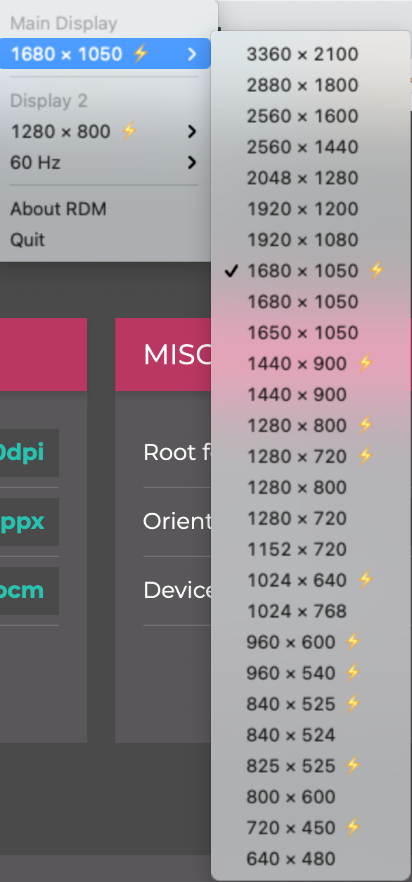
It is possible to achieve a theoretical DPR lower than 1. In other words, using the monitor at a resolution higher than the physical resolution. But this is usually not supported by the OS by default and requires installing additional tools, such as Retina Display Menu (RDM).
In the RDM menu, the display mode with the storm icon next to it will have a logical DPR of 2 regardless of the value of the theoretical DPR.
My 13.3-inch Macbook pro (2020) has a 2560x1600 physical resolution at 227 pixels. From the official website, the OS only supports scaled resolutions of 1680x1050, 1440x900, 1024x640. With RDM, my mac can be displayed at 3360x2100, or 0.7 theoretical DPR.
At 1680x1050, the logical DPR is 2 while the theoretical DPR is 1.52.
PPI re-definition
With the introduction of many keywords above. We can now define the PPI more clearly.
- PPI of a screen: the number of physical pixels in a one-inch length of the screen.
PPI implies the physical pixel's physical size. PPI determines whether a display is HiDPI, while DPRs do not. - PPI in a media format: the information in the media format is used to determine the number of logical pixels used to display the media files in order to achieve a real-world dimension or real-world quality. This varies by the media format and the applications using the files.
For example, I used Adobe Photoshop to show an image of 1024 pixels in width at 300dpi, 100% zoomed, in a 13.3-inch Macbook Pro screen with the physical horizontal resolution at 2560 physical pixels PPI = 227, physical resolution = 1680 x 1050.
- When setting the logical DPR = 2x, the physical width of the image displayed on the screen is 3.413 inches. (3.413 = 1024 / 300).
- When setting the logical DPR = 1x, the physical width of the image displayed on the screen is 8.669 inches. (8.669 = 3.413 * 2).
I will not try to explain why the latter is double the former, because this highly depends on how Photoshop handles the information from the hardware. One we can infer here is that Photoshop tries to give the same quality when showing the image at the 100% zoom level.
DPR in various applications/platforms
Web design
The first introduction of the Retina screen in 2010 with a logical DPR of 2 caused chaos in web designs, or, precisely, the mobile web design. However, all the issues were resolved with the introduction of the reference pixel by W3C.
To get the logical DPR, in Javascript use window.devicePixelRatio, in CSS use -webkit-device-pixel-ratio.
-webkit-device-pixel-ratio is not a standard feature but is supported in all major browser except Internet Explorer.I did a little experiment with Google Chrome (2021, August 19).
In Arch Linux, changing the screen resolution does not affect window.devicePixelRatio's result, while in macOS it changes accordingly. Moving the browser across screens with different logical DPRs also changes the result in Javascript in macOS, but nothing happens in Arch Linux.
-webkit-device-pixel-ratio changes even without browser refresh in macOS both when changing the screen resolution or moving between screens.
CSS Resolution
CSS media query has resolution query that supports 4 types of units: dpi, dpcm, dppx, and x.
x is an alias for dppx. dpcm is a conversion from inch to centimeter of dpi.
dpi = devicePixelRatio * 96
dppx = devicePixelRatioNote: the resolution, and also window.devicePixelRatio and -webkit-device-pixel-ratio all are equal to logical DPR, they are not reliable to be used to get the physical dimension of an object, such as in a ruler utility application.
Note: CSS resolution is not supported in Safari iOS and Safari macOS.
CSS unit
CSS absolute length is defined in physical units and the visual angle unit.
- Visual angle unit: pixel unit
px. - Physical units:
in,cm,mm,pt,pc,Q.
They all have a fixed conversion rate. Depending on the environment, either pixel unit or one of the physical units is defined first, then the others are inferred by their conversion rates.
For a CSS device, these dimensions are anchored either
i. by relating the physical units to their physical measurements, or
ii. by relating the pixel unit to the reference pixel.
It'd be better to quote the official definition from w3c, as it is already concise.
For print media at typical viewing distances, the anchor unit should be one of the standard physical units (inches, centimeters, etc). For screen media, and devices with unusual viewing distances, it is recommended instead that the anchor unit be the pixel unit. For such devices it is recommended that the pixel unit refer to the whole number of device pixels that best approximates the reference pixel.
And the caveats from W3C.
Note: If the anchor unit is the pixel unit, the physical units might not match their physical measurements. Alternatively if the anchor unit is a physical unit, the pixel unit might not map to a whole number of device pixels.
Note: This definition of the pixel unit and the physical units differs from previous versions of CSS. In particular, in previous versions of CSS the pixel unit and the physical units were not related by a fixed ratio: the physical units were always tied to their physical measurements while the pixel unit would vary to most closely match the reference pixel. (This change was made because too much existing content relies on the assumption of 96dpi, and breaking that assumption broke the content.)
Reference pixel
Thanks to what we have discussed in previous parts, you can ignore the definition from W3C and just remember "CSS reference pixel is logical pixel".
Dimension unit in Android
Android supports various units for dimension:
(I will add more information to this section after doing sufficient tests)
dp(ordip): density-independent pixel. This should be interpreted as a logical DPR-independent pixel.sp: scale-independent pixel - scaled by font size.pt: point.px(not recommended): pixel, the number of physical screen pixels (test required).mm: can be inferred fromin.in: physical size in inch.
Dimension unit in iOS
iOS has a much simpler unit system. There is only one unit named point (or pt), that is the same as what we've defined logical pixel.
We have Android's dp = iOS's pt = CSS's reference pixel (in most of the cases, is px).